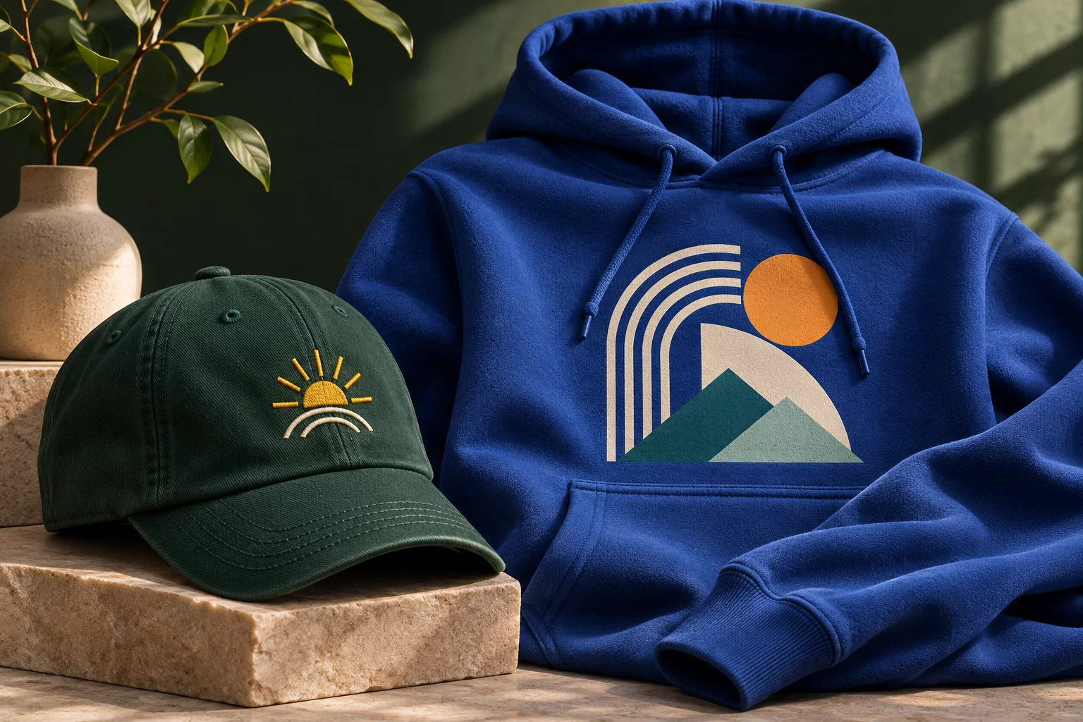
Put the same artwork on a hoodie and a cap and it can feel like two different designs. A hoodie gives you room for a broad composition; a cap asks for a compact mark that reads at a glance. That is why choosing between embroidery and print starts with placement, not a trend.
When embroidery earns its place
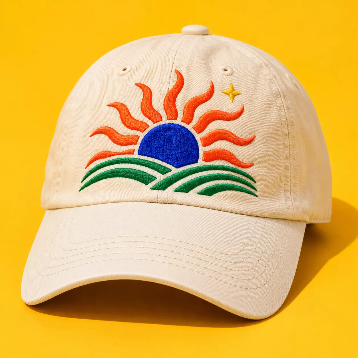
Embroidery builds the image with thread. It has dimension, catches the light and can look especially sharp as a small chest emblem or cap motif. Clean shapes, sensible line weights and limited colour changes tend to translate best. If the idea relies on delicate gradients, a photograph or tiny lettering, thread may simplify or lose the detail.
On a cap, also consider the seam and curved front panels. A beautiful design on a flat screen is not automatically suitable for the crown. Move important details away from seams and give the mark enough breathing room.
When print says more
Print is often the stronger choice for illustrations, expressive colour, large text or photographic artwork. A hoodie front can carry a bold centre graphic, while a smaller print can sit on the chest or sleeve when the product supports that placement. Keep contrast in mind: a dark image on a dark garment may disappear even if the file itself looks perfect.
Print also gives you more freedom to test a composition in different sizes. A huge block of ink, though, may not be the most comfortable everyday result. Sometimes reducing the artwork creates a better garment.
A simple decision test
- Small, clear symbol or initials: consider embroidery, especially on headwear.
- Photograph, gradient or many colours: start by exploring print.
- Mixed collection: adapt the same idea for each product rather than forcing identical placement everywhere.
- Fine type: enlarge it or remove it if it cannot be read at the intended size.
Explore custom clothing and try colour and placement in Studio. The preview helps you decide what looks right; the final decoration method and compatibility are checked for the selected product. For art-file advice, see how to prepare your artwork.
Further reading: Printful’s comparison of DTG and embroidery.