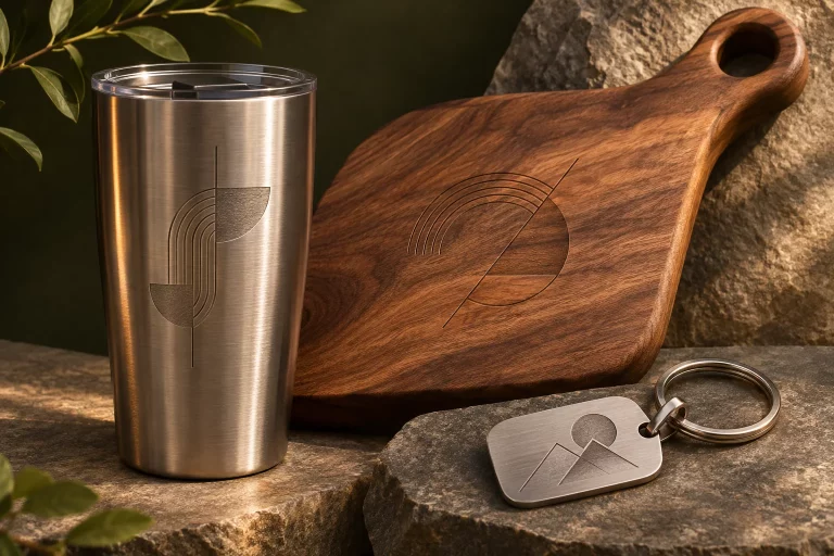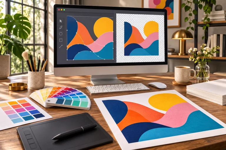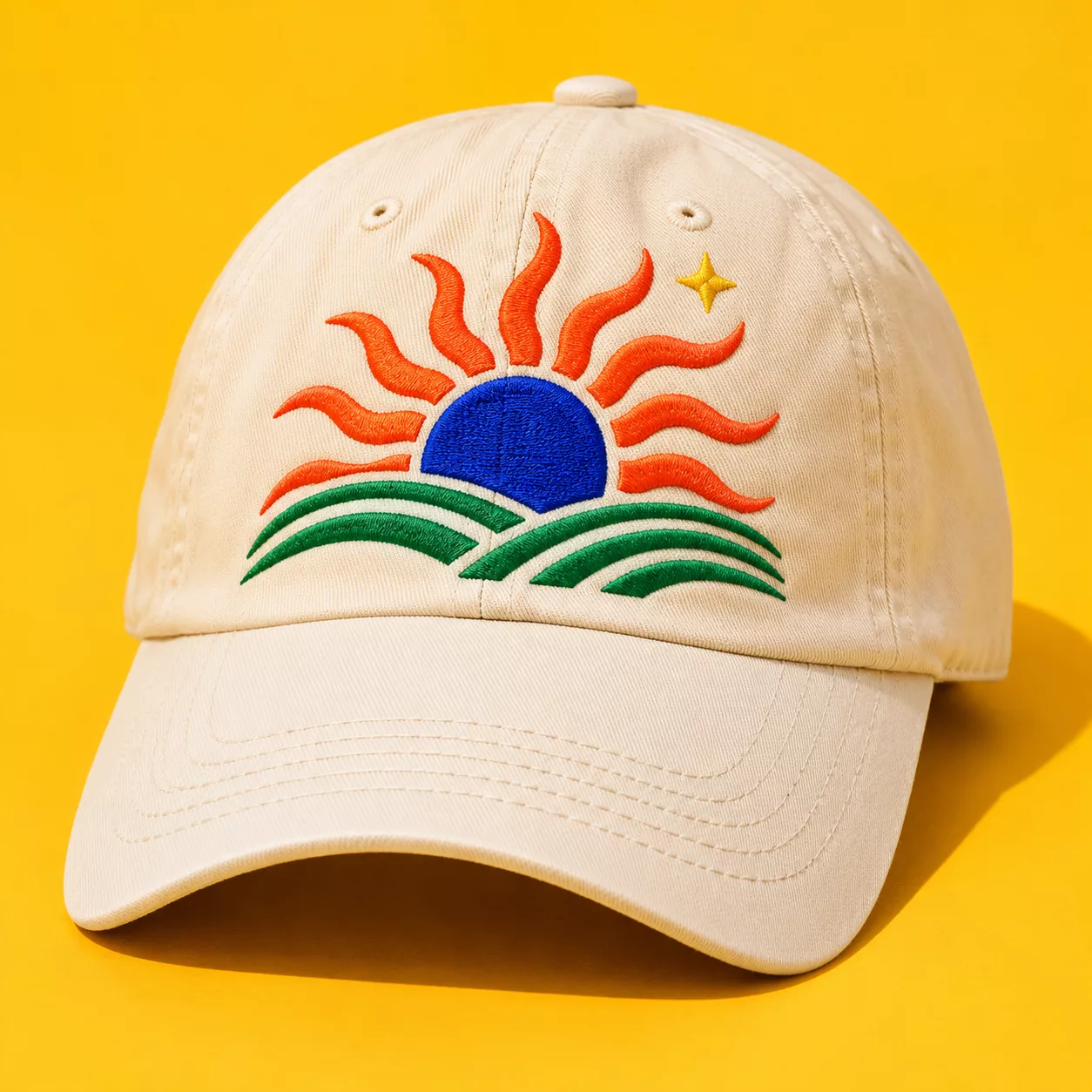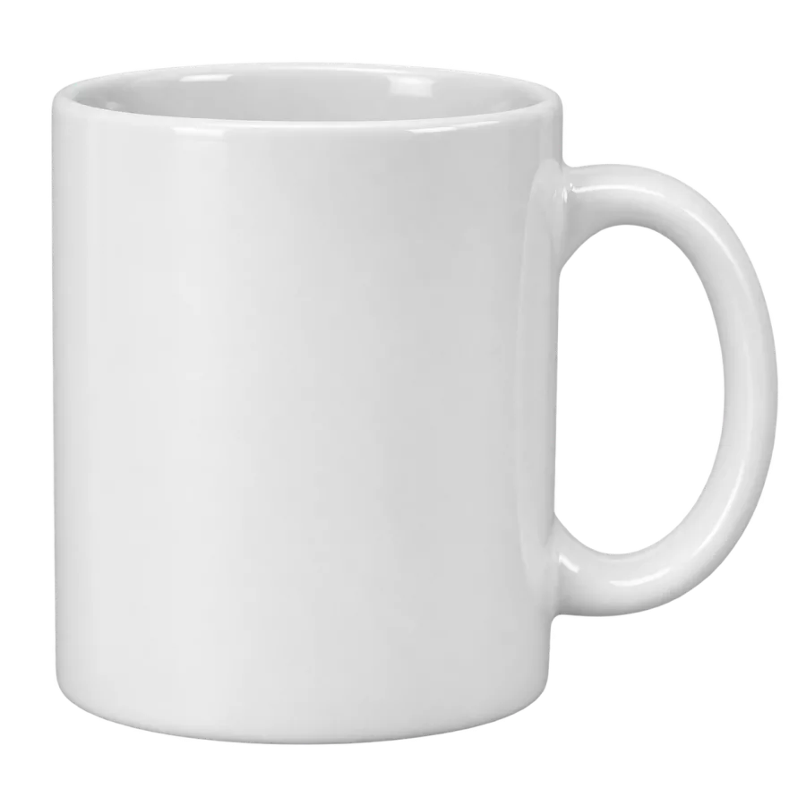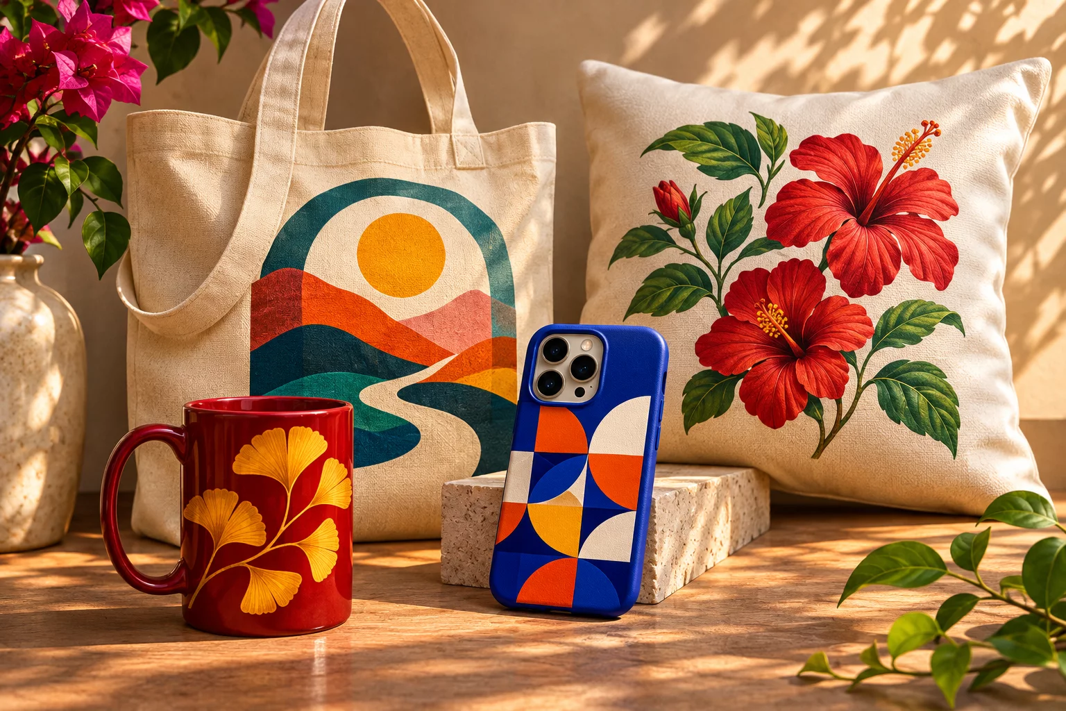
One memory can make a lovely set of gifts. That does not mean pasting the same square image onto everything. A mug is seen in a hand and often from one side. A tote moves and folds. A phone case has a camera cutout and very little spare space. Treat each surface as a new composition.
Start with the meaning, then choose the shape
Pick a simple thread that can travel across products: a place name, a colour, a line drawing or a small set of shapes. On the mug, it might become a wrap or a bold central motif. On the tote, give it more space. On the phone case, reduce it to the strongest part so the camera area does not eat the design.
A useful test is to describe the idea in one sentence. “The coastline from our first trip” is clearer than “all the photos from the trip.” You can still use a photograph, but you will know which one deserves to lead.
Mugs: think about where the hand goes
Look at the print area and handle in the preview. Place essential words or faces where they can be seen, rather than assuming one side of the mug works for every viewer. Strong contrast helps a small motif stand out. If you choose a coloured mug, check that the image remains legible against that colour.
Totes: make it readable at a distance
A tote is a moving canvas. A large, simple illustration can work better than a small block of text. Keep important detail away from seams and folds, and imagine the bag filled rather than perfectly flat. If the art is a photograph, crop deliberately so the subject still reads when the fabric moves.
Phone cases: leave room for the hardware
Never park a name or the best part of a picture under the camera opening. Keep small type to a minimum and let the composition breathe. High-contrast colour can make a compact design feel intentional rather than crowded.
Browse gifts and everyday products, then try your artwork across products in Custom Studio. For the file itself, our artwork guide covers resolution and transparent backgrounds. For a larger matching set, ask about a group order.